Jennifer de Leon | art director & graphic designer

Alaska Airlines Magazine Ads
These Alaska Airlines magazine ads ran monthly. They featured RUI's prime locations for an multi brand awareness campaign that celebrated each brand's uniqueness. I wanted the layouts to be colorful and convey a contemporary feel. With the use of muted pastels against the achromatic grays, I wanted to present a contrast that would be eye catching. In addition, the diagonal lines suggest movement and vitality in the design.
no. 1

no. 2
WEA Honesty In Education Campaign Concepts
Thoughts behind the concept: Since the focus was on having the same quality education no matter the color or background. I wanted to portray a teenage girl with an historical figure that represents her. MLK/The Civil Rights movement is a great example of how far reaching and inspiring a single individual can be. The design was created using circular graphics around their heads, to reinforce the idea that our teachings/thoughts, and quite frankly, our dreams reside in our minds. Also that the mind unlocks our barriers to achievement and triumph. The accompanying b/w image is an example of the other side of the issue; giving our children the right to have an honest education so they may learn from the teachings of our past.
no. 3
Henry's Tavern Pitch Book
I designed a detailed “lookbook” for Henry’s Tavern that explores the concept for future growth. I was present at the photo shoots and collaborated with wonderful photographers such as Kevin Fry and Patrick Darby from Tonic, as well as food stylists and chefs. Art direction is a passion and the opportunity to guide such talented people towards a specific vision is what I relish. I chose to showcase the brands urban tavern feel with exposed white brick and neutral tones on the cover of the book, while keeping a clean modern look with the type treatments and bold visuals. Clean lines meet modern gastro pub is my vision for redefining what a new barroom can be. The motivation was to take the viewer on a tour of the already established restaurants as well as their food offerings. With this book our company was able to gain funding to open a new location in South Lake Union.
Project no.5
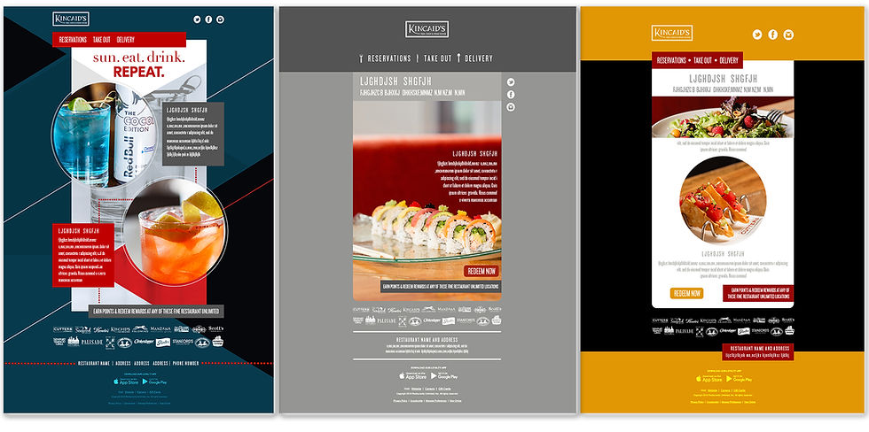
Email Template Comps
At RUI I was tasked to design emails for both Fishbowl and My Emma, our email service providers. The output was 350 discrete emails per our brands and their subsequent locations, thus making the volume of email blasts per month at about 1.5 million, with an average open rate of 20%. To keep evoke guest engagement, I maintained a series of new rotating comps that I would present to leadership. This allowed us to stay current and evolve while keeping within our brand standards.
no. 4

no. 5
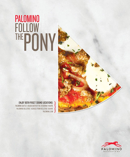
Palomino Magazine Ads
Palomino is a brand that leaves me feeling a little sentimental. I used to be a server at this restaurant while attending art school. It was a truly gratifying to design pieces for them. These were magazine ads that promoted our Puget Sound locations. I used a marble background as a design element because the restaurant used marble tabletops and I wanted to incorporate that. The obstacle was how to present pizza in an innovative way. The solution was to target the individual elements of a pizza and highlight their beauty to celebrate a food staple we've all grown up with.
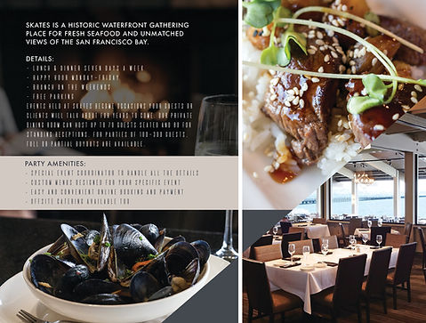
Skates on the Bay is a unique concept located in Berkeley California. At the time this design was created they had just finished a remodel and wanted to promote banquets and large party bookings. I designed their guest-facing collateral; presentation folder, bi-fold brochure and postcards. I focused on the location images since this was a big draw. The food shots were intentionally oversized to dramatically enhance the visual experience. And the typography treatment was intended to project a modernistic style. I enjoyed being playful with the asymmetrical composition and was pleases with the freshness of the layouts.
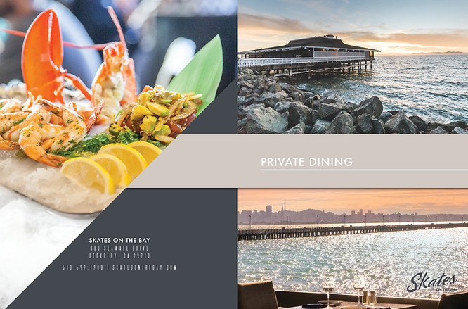
Skates Banquet Collateral
no. 6